Behold! Some much-needed improvements to our new website design were unveiled on Friday, a month and a day after its relaunch. Many of these changes are in response to valued feedback from our members, both on the ‘ new clothes’ forum thread and via email. Many others are backstage alterations to optimise the way the team manage the site. Plus we have been working hard to solve a few particularly perplexing and persistent bugs.
Here follows a guide to what has changed, in three parts. Click below to jump to that section of this report.
1. New updates
2. Forum access
3. Browser compatibility and responsive design
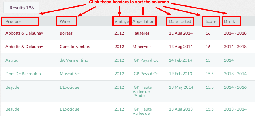
Sortable columns in tasting notes search results were introduced a few weeks ago, as we hope you’ve noticed. This means you can arrange tasting notes by producer, wine (ie the cuvée name), vintage, appellation, date tasted, score and suggested drinking date by clicking on these words at the top of the table of results. If you click on that word a second time, the results are presented in reverse order.

The other main request from visitors to our site in response to the new design related to font size. You may have noticed that we have reduced heading sizes across the site. We have also introduced the 'aA' icon illustrated below right that toggles the size of the body text. Just click on this to choose the size of text that suits you best. There are still a few areas where this doesn’t yet behave quite as we'd like, but we hope this will address the complaints of those who found the text too big initially.

Another popular request was that we reinstate an RSS feed. This has been restored, at JancisRobinson.com/feed.rss. (This link may not mean anything to you if you do not use an RSS feed!) I have also created a new IFTTT recipe that triggers an email to your preferred address whenever a new article is published.
Also within tasting notes, menu items are now faceted – that is, dropdown menus are automatically filtered. So, for example, if you select Argentina from the country menu, the appellations from which you can choose are exclusively Argentine appellations. And so on.

Drink dates have been added to the tasting note search form. Choose a year and the search engine will display only those wines that are recommended for drinking in or after that year.
And finally, we have introduced many cosmetic and style improvements of which these are but a few:
– The invitation to sign up for our weekly newsletter is shown only to those who have not yet signed up for it.
– Article images on the home page are now hyperlinks to the relevant article.
– The tablet and mobile views have been tided up in many ways.
– The word ‘Companion’ no longer obscures the login link in the menu bar – see the 'responsive design' section below for more explanation of this strange phenomenon.
Our profound apologies to all members who found that their access to our forums was denied. This took a considerable amount of diagnosis, largely because the forum is a vast and unwieldy piece of third-party software that is not easy to work with. But thanks to the patience and responsiveness of many of these strangely barred members, we have been able to figure out what was happening.
We have identified and fixed two separate problems that were locking members out. The first was caused by the use of accents in either the name or location fields of account details, with the forum apparently suddenly intolerant of any accented character.
The second was to do with passwords, and how they are shared between our servers and the forum. It seems that any member who changed their login password was immediately unable to access the forums, which holds discrete user details. The offending piece of code has been identified and beaten into submission.
Those who have experienced these extremely annoying problems may still need to clear their cookies before the issue is fully resolved. That’s because our forum cookie remembers your login details, and so will need to be deleted before access is restored.
The step-by-step process is as follows:
– Log out of JancisRobinson.com
– Clear your cache and cookies – see here for how that can be done
– Log back in to JancisRobinson.com
– Visit the Discussions page – and you should now have forum access. Don't hesitate to contact us if problems persist.
BROWSER COMPATIBILITY AND RESPONSIVE DESIGN
There are two points to make here. Without becoming too techie, our new site adopts the newest technologies – especially in the way that pages are displayed. That means that some older browsers are unable to render the designs in the way they are intended. To ensure you have the best experience, please ensure you are using browsers no older than Internet Explorer 9, Safari 6, Chrome 30 and Firefox 24. Upgrading browsers is free, and you can find about the various options here. Below are two screenshots comparing old and new browser views. I hope these illustrations are self-explanatory!


The second point is related to responsive design. This means that, to take account of the many different variants on hardware we all use nowadays, the site changes according to the size of screen you are using. This means it will automatically reconfigure itself when viewed on a tablet or mobile. It also affects the size of the desktop view if your browser window is below a certain size. This doesn’t affect functionality – just appearance. Try changing the zoom settings of your browser or your screen resolution if you want to alter your desktop view of JancisRobinson.com.
There are many more improvements in the pipeline, which we will be introducing at regular intervals. Please do keep in touch with us, via the forum or the contact form, about what else you would like to see here on JancisRobinson.com.


